Adding letters to a project is one of the quickest ways to make it feel like it was made just for someone. A name on a baby bib, a tiny initial on a napkin corner, a favorite short quote on a hoop. It sounds simple until you actually try to stitch an “S” and it suddenly looks like a wiggly snake.
I promise this gets easier fast. Lettering is just a mix of two skills: choosing a letter style that suits your project, and using a stitch that behaves nicely around curves and corners. Let’s walk through both, plus the layout tricks that keep your text looking polished and intentional.
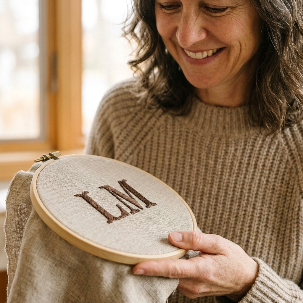
Embroidery vs cross stitch letters
Before we get into fonts and stitches, it helps to know what kind of “lettering” you are doing. The setup changes the whole experience.
Hand embroidery letters
- You can use many fonts since you are not restricted to a grid, but very thin or super-detailed fonts may need simplifying.
- Curves can be smoother, especially with outline stitches.
- Transfer matters because you usually stitch on blank fabric.
Cross stitch letters
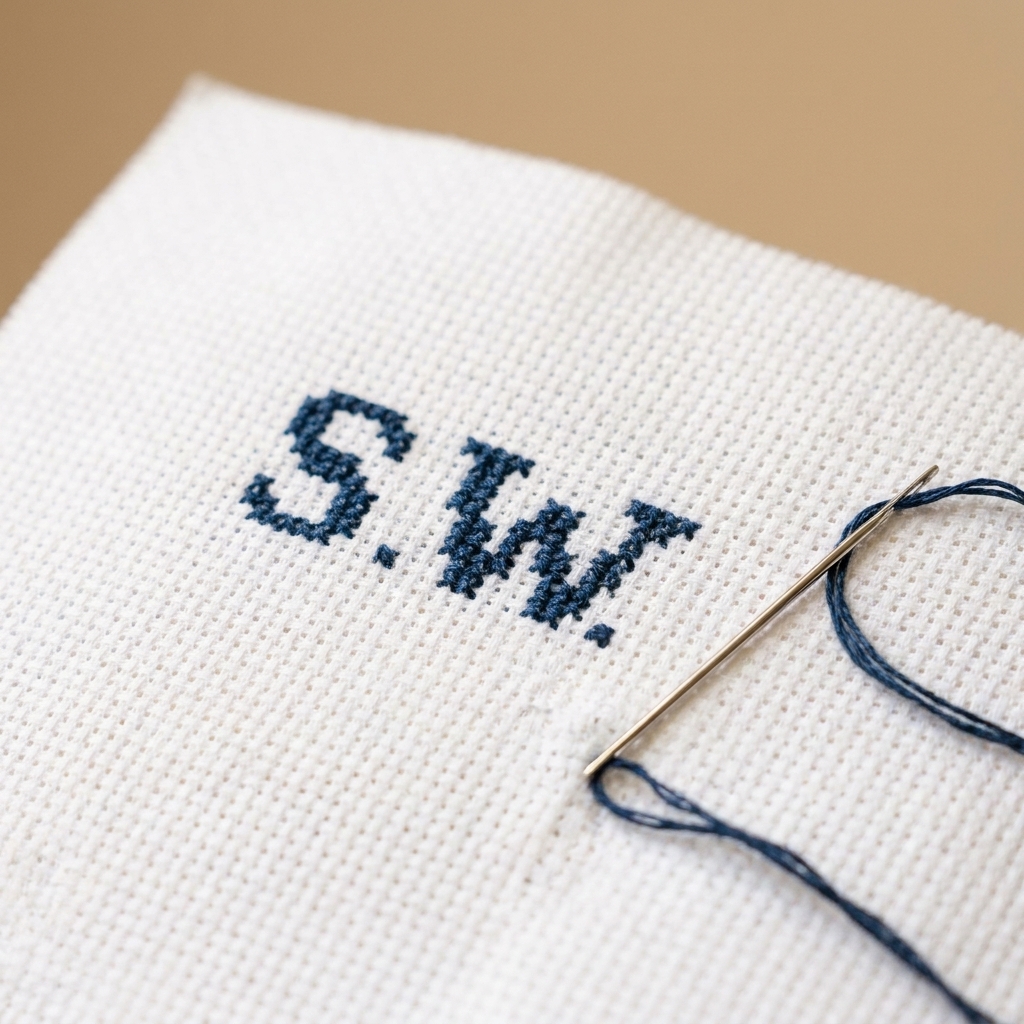
- Letters are built on squares, so fonts need to be charted for a grid.
- Spacing is easier because each stitch is one square.
- Small text can get chunky if your fabric count is low.
If you are brand new, cross stitch text can feel more straightforward at first. If you want a more handwritten look, hand embroidery is your best friend.
Beginner stitches for letters
The stitch you choose is the difference between “sweet and polished” and “why is my ‘E’ melting.” Here are my go-to picks, plus when to use each one.
Backstitch (best all-around)
Backstitch is my first recommendation for most beginner lettering. It makes clean lines, handles corners beautifully, and is easy to control.
- Great for: serif fonts, block letters, simple scripts, small to medium text
- Tip: use shorter stitches on curves and slightly longer ones on straight lines for smoother results
Split stitch (smooth curves)
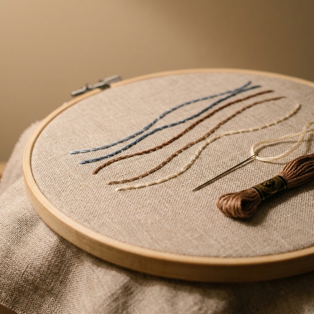
Split stitch looks similar to backstitch, but the thread splits the previous stitch. It gives a softer, more continuous line that’s gorgeous for cursive or rounded fonts.
- Great for: script fonts, floral monograms, anything curvy
- Tip: this stitch looks especially nice with 2 strands of floss, but you can go down to 1 strand for tiny letters
Stem stitch (classic script)
Stem stitch has a gentle twist to it, which makes lettering look a little more calligraphic. It is lovely, but it does take a bit of practice to keep the twist consistent.
- Great for: cursive names, swoopy initials
- Tip: keep your working thread on the same side of the line every time (many stitchers keep it consistently below the line as they stitch) so the rope twist stays even
Satin stitch (bold, used carefully)
Satin stitch fills shapes, so it is wonderful for chunky monograms and single initials. It can also get lumpy fast if the shape is large.
- Great for: a single big initial, small block letters, monogram centers
- Tip: outline the letter first (backstitch or split stitch) and then fill it for cleaner edges
Chain stitch (playful texture)
Chain stitch makes a bouncy, decorative line. It is not the tiniest-letter champion, but it is adorable for medium-sized words and names.
- Great for: casual fonts, thicker lines, whimsical designs
- Tip: keep chains small and consistent so the letter shape stays readable
Cross stitch letters (on the grid)
For cross stitch, the “look” of your letters is heavily influenced by your fabric count, but you still have options. Strand count, backstitch details, and even the occasional half-stitch can change how crisp a font feels.
- Great for: samplers, wedding dates, labels, heirloom-style pieces
- Tip: add a backstitch outline to cross stitch letters for extra clarity, especially on small fonts
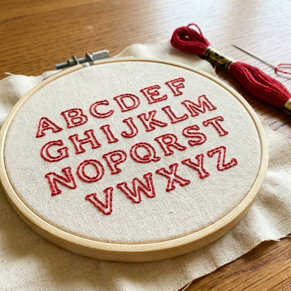
Choose a font that stitches well
The best lettering font is the one that stays readable after it turns into thread. Some fonts are gorgeous on a screen and a total headache in floss.
Font rules that save time
- Avoid super-thin hairlines unless you plan to stitch with 1 strand and teeny stitches.
- Limit fussy serifs on very small text. Chunkier serifs stitch better.
- Watch tight loops in script fonts. If the loops are smaller than your stitch length, they will blur.
- Match font style to stitch style: blocky fonts love backstitch and satin stitch, scripts love split stitch and stem stitch.
Beginner-friendly styles
- Sans serif block letters (clean, modern, easy to space)
- Simple serif letters (classic, sampler-friendly)
- Loose script (flowy, forgiving, pretty for names)
- Monograms with thick strokes (perfect for satin stitch or padded satin stitch)
When in doubt, pick a slightly thicker font than you think you need. Thread has bulk, and bulk is not the enemy. It is just something we design around.
Transfer letters onto fabric
For hand embroidery, transferring your letters neatly is half the battle. Choose a method that matches your fabric color and how permanent you want the marks to be.
Washable fabric pen
My everyday choice for light fabrics. Test on a scrap first, especially if your project will not be washed right away.
- Best for: cotton, linen, light-colored fabrics
- Watch for: some pens (especially heat-erasable and some water-erasable inks) can reappear with cold or time, which is why I like to rinse projects after stitching when possible
Pencil (yes, really)
A regular pencil can work beautifully on light linen. Keep the line faint and stitch directly over it.
- Best for: linen, pieces that will not be washed often
- Watch for: heavy pressure, which can leave an imprint
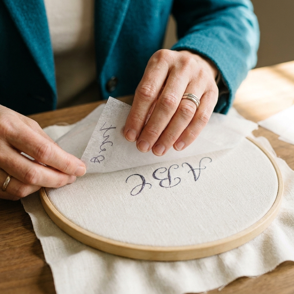
Water-soluble stabilizer
This is the “I want it to be foolproof” option. You print or draw the letters onto the stabilizer, stick it on your fabric, stitch through it, then rinse it away.
- Best for: dark fabrics, slippery fabrics, detailed fonts
- Watch for: leaving any bits behind in dense satin stitch, so rinse thoroughly and gently
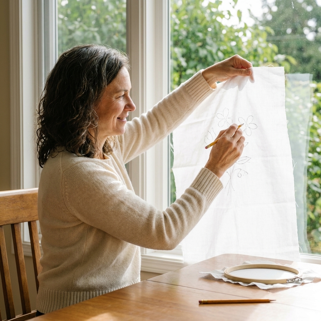
Lightbox or window tracing
Tape your printed letters behind your fabric and trace. This feels like craft magic the first time you do it.
- Best for: lighter fabrics, quick projects
- Watch for: thick fabrics that do not let enough light through
Layout and spacing tips
Even simple letters can look off if the spacing is weird. This is the part that makes your embroidery look finished, even if your stitches are still a little beginner wiggly.
Start with a center point
For a name or quote, fold your fabric lightly in half (and in half again if needed) to find the center. Mark a tiny dot at the center point. This makes it much easier to keep your text centered.
Use baseline guides
Lightly draw two straight lines: one for the baseline (where most letters sit) and one for the cap height (top of capital letters). If you are stitching script, add a third line for the x-height (height of lowercase letters). This keeps your letters from slowly drifting uphill like they are trying to escape the hoop.
Mind kerning (letter spacing)
Some letter pairs want to snuggle, like A and V. Others need breathing room, like M next to almost anything. If you are tracing a font, the spacing is usually built in. If you are hand drawing, step back and look at the word as a whole before you commit.
For monograms: pick a hierarchy
The prettiest monograms have a plan. Choose what you want to be the star letter.
- Single initial: one large letter, centered
- Two-letter monogram: same size letters side by side, or stacked
- Three-letter monogram: center letter larger (often the last name), with two smaller letters flanking it
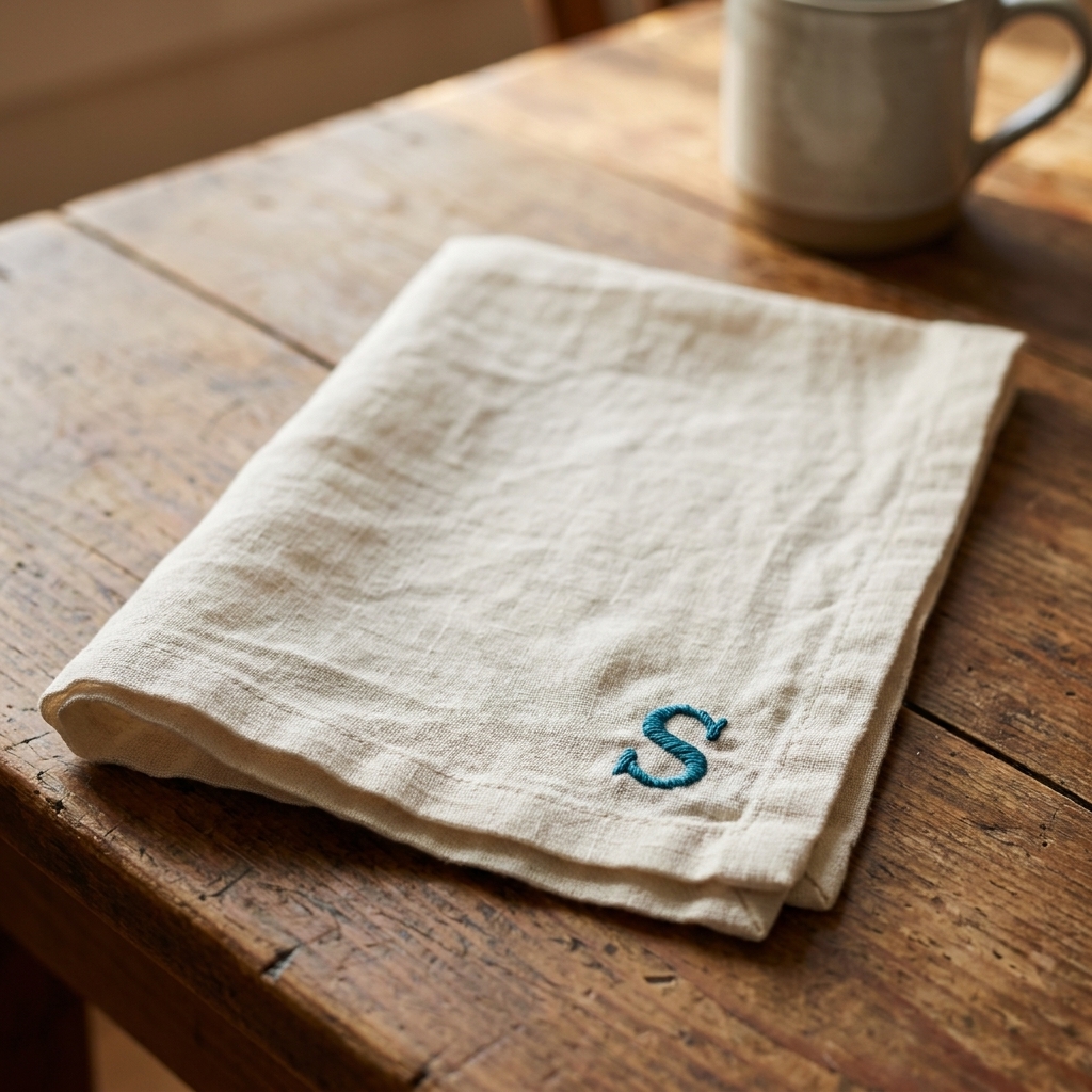
If you are stitching on something functional like a towel or napkin, keep the monogram slightly smaller than you think. Big monograms are gorgeous, but they also tend to get distorted by folding and daily use.
Thread and fabric choices
Lettering is picky about thickness. A tiny change in strand count can take your letters from clunky to crisp.
How many strands should you use?
- 1 strand: tiny text, delicate scripts, very fine lines
- 2 strands: most lettering on medium-weight cotton and linen
- 3 strands: bolder names, towel bands, thicker outlines
- More than 3 strands: usually better for chunky satin stitch initials, not small text
Floss vs perle cotton
Embroidery floss is the usual choice because you can split it into strands. Perle cotton (like size 8 or 12) is a single, twisted thread that can give you bold, clean lines fast. It is great for bigger initials, towel lettering, and simple script that you want to look slightly raised. For tiny text, floss is easier to fine-tune.
Fabric texture affects readability
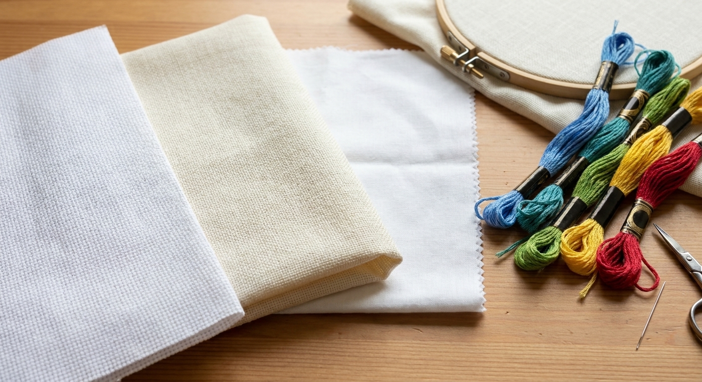
Smooth cotton makes sharp letters. Linen adds beautiful character, but the weave can gently nudge curves into a more rustic look. Aida and evenweave are ideal for cross stitch lettering because the grid keeps everything aligned.
Hoop tension helps
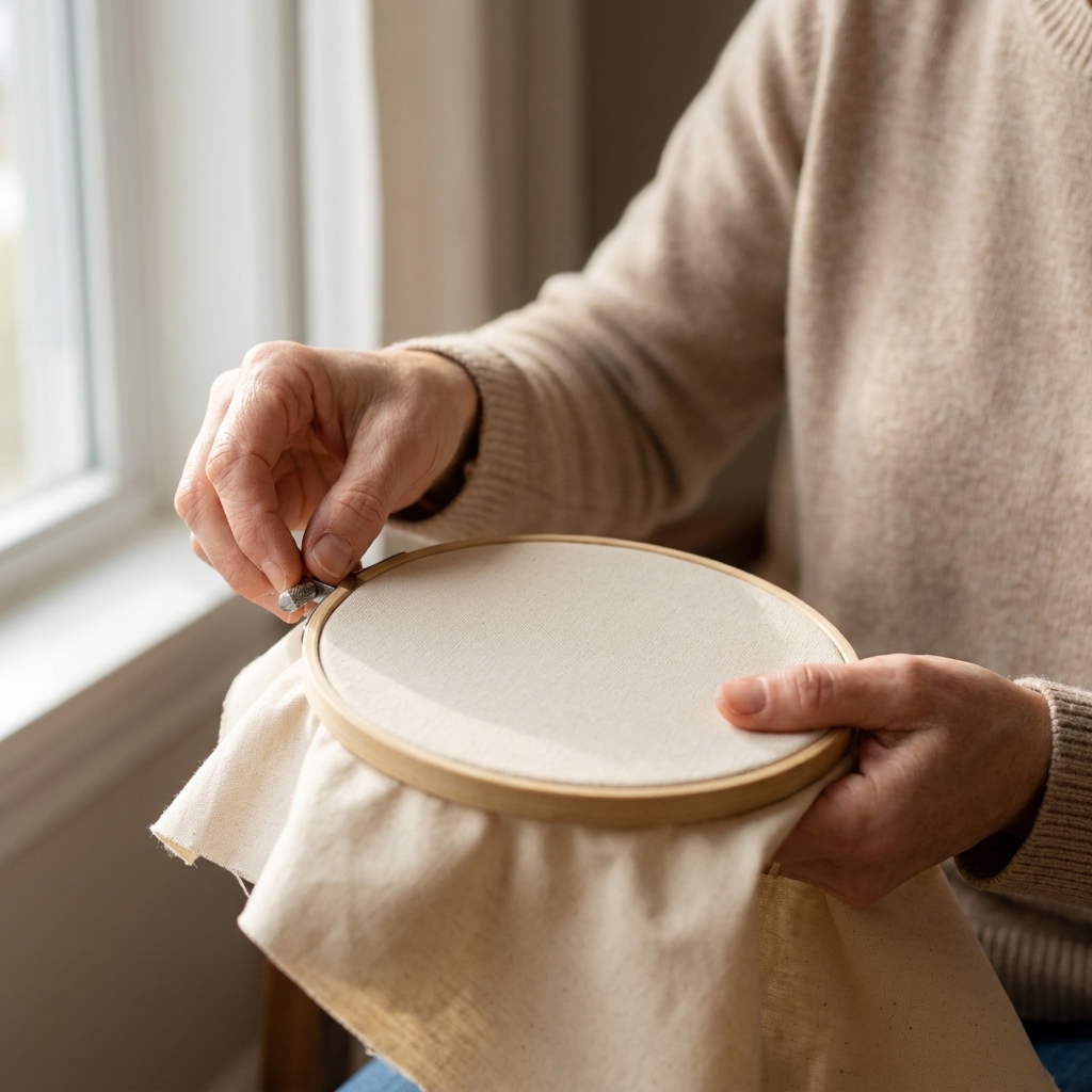
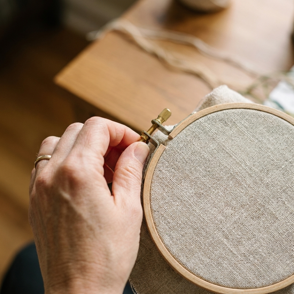
If your fabric is loose, your letter shapes will wobble. Tighten your hoop until the fabric feels like a drum. If it starts to slacken while you stitch, pause and re-tighten, especially before curves and corners.
Step-by-step: stitch a name
If you want a simple path to follow, here is my beginner routine. It works for names, short words, and little phrases.
- Pick a readable font. Choose something with medium thickness and not too many tight loops.
- Decide size and placement. Mark the center point and draw baseline guides.
- Transfer the letters. Use a washable pen, pencil, or water-soluble stabilizer.
- Choose your stitch. Backstitch for crisp lines, split stitch for smoother curves.
- Start in the middle of the word. This helps you keep spacing balanced and reduces the chance you run off the edge.
- Shorten stitches on curves. This is the number one trick for cleaner letters.
- Secure ends neatly. Run the thread tail under a few stitches on the back for a flatter finish. Knots are also fine when the back will never show (or the fabric is plush and forgiving), but try to keep them small.
If your first attempt looks a little shaky, keep it. I have an early monogram sampler that looks like the letters were stitched on a boat. It is still one of my favorite reminders that skill shows up after repetition, not before.
Step-by-step: cross stitch initials
Cross stitch initials are wonderfully addictive. You finish one and immediately want to add them to everything in your house.
- Pick the fabric count. Higher count equals smoother letters. If you want tiny, refined initials, consider 16 to 18 count Aida or 28 count evenweave over two.
- Estimate finished size. On 16-count Aida, 16 stitches equals 1 inch. So a 10-stitch-tall letter will be about 5/8 inch tall.
- Choose an alphabet chart. Make sure it matches the vibe of your piece: classic sampler, modern sans serif, playful pixel style.
- Find the center. Fold your fabric to find the center point and start there if you want perfect placement.
- Stitch the letters. Keep your crosses consistent in direction so the text looks tidy.
- Add backstitch if needed. A simple outline can sharpen small letters and make them pop.
Common problems and fixes
My letters look wobbly
- Use shorter stitches, especially on curves.
- Increase hoop tension and re-tighten as needed while you work.
- Try split stitch for a smoother line than backstitch.
My satin stitch looks bumpy
- Outline first, then fill.
- Keep stitches parallel and snug, but not pulling tight.
- For large initials, add a light padding layer (a few horizontal stitches underneath) before the final satin stitches.
My text is hard to read
- Increase the size slightly.
- Use fewer strands for small letters, more strands for bigger letters.
- Choose a simpler font with fewer skinny bits.
My spacing looks uneven
- Mark the center and start from the middle of the word.
- Lightly draw guidelines for baseline and cap height.
- For hand lettering, write the word on paper first and adjust spacing before transferring.
Practice project ideas
If you want to get comfortable fast, small, low-pressure projects are the way. You will learn more from three quick initials than one giant quote that takes two weeks and a lot of sighing.
- Monogram corner napkins: one letter, one color, instant satisfaction
- A mini hoop name plaque: a first name plus a tiny floral accent
- Gift tags on fabric scraps: practice small lettering without commitment
- Cross stitch label for a sampler: add a date or location under a motif
- Towel band initial: bold letter in satin stitch on a towel border or banding
Care and finishing
Once the last stitch is in, a little cleanup makes your lettering look even better.
- Rinse or wash out marks: follow your pen or stabilizer instructions, and test any method on a scrap when you can.
- Rinse stabilizer thoroughly: especially around dense stitches, so no gummy bits dry in the thread.
- Press safely: let the piece dry, then press from the back on a towel (so the stitches sink in instead of getting squashed).
FAQ
What is the easiest stitch for embroidered letters?
Backstitch is the easiest and most reliable for beginners. It creates clean lines, turns corners well, and looks good in both simple block fonts and many scripts.
How do I embroider letters on dark fabric?
Use a water-soluble stabilizer on top of the fabric so you can see your lines clearly. After stitching, rinse it away. A chalk pencil can also work, but stabilizer is usually the least frustrating.
Should I knot my thread when stitching text?
You can, but I usually do not for lettering. Knots can create little bumps that show through, especially on smooth fabric. Instead, anchor with a tiny waste knot away from the area or weave the tail under a few stitches on the back. If the back will never be seen, small knots are perfectly acceptable.
How do I make a monogram look balanced?
Decide on a clear focal letter and keep the others secondary. For three-letter monograms, the center letter is typically larger. Also, keep your spacing consistent and use guidelines so everything sits on the same baseline.
Can I mix embroidery and cross stitch letters in one project?
Absolutely. A fun combination is cross stitch for the main word (clean and structured) with a little hand embroidered flourish, like a vine or underline, in stem stitch or chain stitch.